
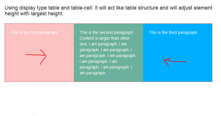
Using display: table and display: table-cell for parent and child elements respectively will help in adjusting 100% height for all child elements. It will take max height from all child elements and will use the same height for other child elements too.
Sometimes it may happen that we have multiple child div elements inside a parent div element and we need all child divs to maintain 100% height to its parent. I searched google for a long time and get many solution for this situation. Many says that I should use javascript/ jquery to calculate max height and assign to all the child divs. Many says that I should write a long css for this. But implementing all such solution, I got a simple and two line code solution for this problem. Will describe in below lines.
Using display: table; convert a block element into tabled type structure and start acting similarly as table. It takes max height among all child element will resize other element equal to that element.
Before start let's see how we face such issue.
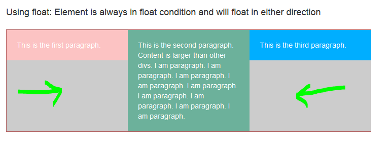
We generally use float property to adjust elements position which sometime is not good for our health too. I am talking about this problem now a time. In below screenshot I am explaining same situation I was talking about. I have three child divs inside a parent div. Second div has more content but other two have not. You can see how these divs a aligned and nobody likes such a raw UI. Do you? Not really... The reason behind this is because I am using float property to adjust child divs which we normally practice in daily development.
Let's see the style and html in short.
/*using float property*/
.mainCol-float {
    float:left;
    width:100%;
    background-color: #ccc;
    color: #fff;
    border: 1px solid #b36161;
}
.col1{
    width: 33.33%;
    background-color: #fcc3c3;
    float:left;
    padding: 20px;
}
.col2{
    width: 33.33%;
    background-color: #6cb19b;
    float:left;
    padding: 20px;
}
.col3{
    width: 33.33%;
    background-color: #00aeff;
    float:left;
    padding: 20px;
}
            <h3>Display type table and table-cell example</h3>
            <h4>Using float: Element is always in float condition and will float in either direction</h4>
            <div class="mainCol-float">
                <div class="col1">
                    This is the first paragraph.
                </div>
                <div class="col2">
                    This is the second paragraph. Content is larger than other divs.
                    I am paragraph. I am paragraph. I am paragraph. I am paragraph. I am paragraph. I am paragraph. I am paragraph. I am paragraph. I am paragraph.
                </div>
                <div class="col3">
                    This is the third paragraph.
                </div>

            </div>
To overcome this problem I will use simple display property and will choose one of its attribute and that is table with table-cell.
I have written same code and just changed float property with display: table and display:table-cell for parent and child elements respectively and you can notice my problem is solved.
Let's see the style and html code quickly. You can download all these code above from download code button link which is available in most of my articles.
/*display type table*/
.mainCol{
    display: table;
    background-color: #ccc;
    color: #fff;
    border: 1px solid #b36161;
}
.col4{
    width: 33.33%;
    background-color: #fcc3c3;
    display: table-cell;
    padding: 20px;
}
.col5{
    width: 33.33%;
    background-color: #6cb19b;
    display: table-cell;
    padding: 20px;
}
.col6{
    width: 33.33%;
    background-color: #00aeff;
    display: table-cell;
    padding: 20px;
}
<h4>Using display type table and table-cell: It will act like table structure and will adjust element height with largest height.</h4>
            <div class="mainCol">
                <div class="col4">
                    This is the first paragraph.
                </div>
                <div class="col5">
                    This is the second paragraph. Content is larger than other divs.
                    I am paragraph. I am paragraph. I am paragraph. I am paragraph. I am paragraph. I am paragraph. I am paragraph. I am paragraph. I am paragraph.
                </div>
                <div class="col6">
                    This is the third paragraph.
                </div>

            </div>
Did you notice, using a simple attribute made my life easier. I hope you are now clear what I meant to say. Please use this in you real code and see how you can use it. Thanks for reading this article. I will write more soon.


